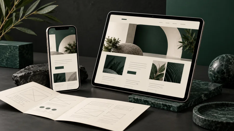
Make your QuickPage website work beautifully on mobile
Code: NP-BLO-00008-1
Your mobile visitors need the same clarity as your desktop visitors, with less space to find it. Use this short review before publishing your next QuickPage update.
Start with the reading order
A two-column desktop section often becomes a single column on a phone. Read it from top to bottom. Use the mobile priority and image-order settings to support the story.
Keep the message compact
Short headings and focused paragraphs are easier to scan. If a heading breaks into five lines, simplify the wording before reducing the font size. Avoid spaces used to force alignment.
Choose images with room to crop
Keep the important subject away from the outer edges. Check the dedicated image field at a narrow width. A desktop crop can hide useful detail on a phone.
Make the next step easy
Use descriptive links and leave space around buttons. Test contact links on a real phone. Visitors should reach you without zooming or hunting through the page.
Review the public page
Publish, open the live URL and inspect every section at a narrow width. Check the menu, images and form fields. The editor alone does not prove that the public page works.
Need help making your site easier to use? Visit the Contact page and tell me what you would like to improve.